

Possible change image and look!
During the COVID we have taken the opportunity to turn our image around.
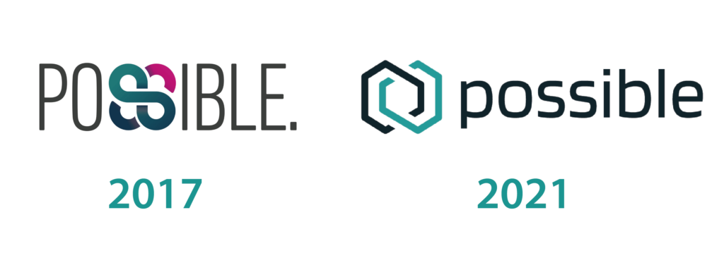
Possible change of image, a new change that will identify more with the company and its objectives.
Why Possible changes its image?
For a couple of years we wanted to change and refresh our corporate image for two reasons: one aesthetic and the other because we have changed as a company.
From an aesthetic point of view, Possible change its image, its logo, logo and colors, positioning us in a fresher and younger type of company typical of the first years, but now after 8 years. Obviously we have evolved and although our team is still young (thanks to new hires), the company itself is already gaining experience, structure and size.
From a functional and / or mission or company vision point of view, we have created a new line of business focused on the extraction of knowledge or (data knowledge) as he likes to explain to the members of the data science team. And it is that we are promoting since 2018 services related to the ability to analyze data feed to extract information from them. Data is not always the same as information, especially when the sources are multiple, they are updated in real time or very quickly and volatility is important.
How do you change your image and with whom?
In a natural way, we speak with our regular collaborators in the branding and corporate image part. At this time, we decided to put our new logo, corporate image and branding in Disonmia (https://disomnia.com/). Alicia Bolaño has been working with us on different projects over the last 4 years. With her there was that degree of trust and mutual knowledge to make the work easy and smooth.
With it, we got to work in the middle of COVID to begin developing the corporate manual, the graphic letter, logos and images and the new website that is already published today.
Persons
Within the Possible team, all the members have participated contributing their grain of sand to the new image of Possible. From partners to members of the technical team, collaborators, clients, etc… We wanted it to be as good as possible and not to lose the concepts and values of the company.
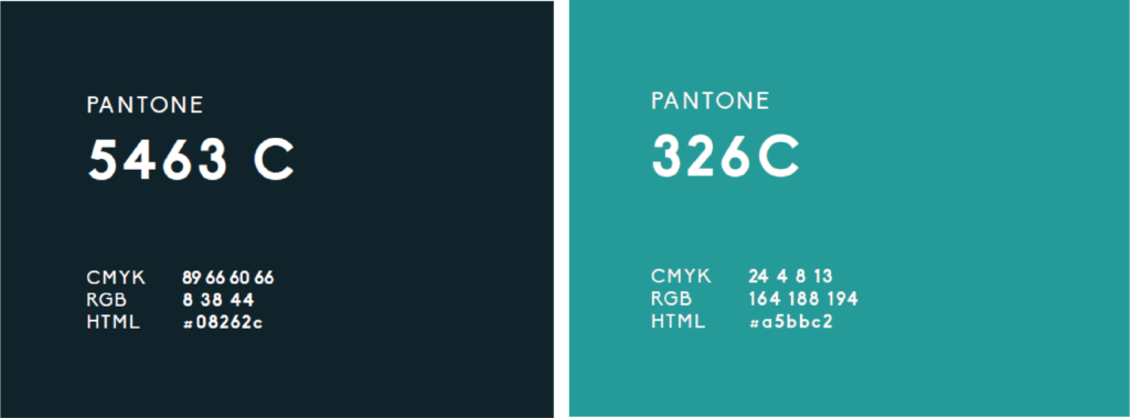
The result is an image more consistent with a digital company with colors that reflect senerity and seriousness and a typography that without being too serious (because we did not want to lose that youthful touch either) is simple and functional to be able to reproduce it in any format, graphic application and document (something that was important to us and not having to deal with complicated fonts).
How will our look change in the future?
We do not know how we are going to evolve exactly at the company level. With how fast the market changes and especially the digital sector, it is very likely that within 2 years everything will be different. Today logos and images are no longer timeless. Formerly in the 80s and 90s a company could be with the same logo and corporate image for 10 or 20 years.
It seems that the trend today is to adapt the corporate image to the evolution of markets and trends. It is a way of implying that the company is flexible and adapts to the evolution of society and the industry.
Image change results
The truth is that we are very happy with the results of the Possible look change. There will always be opinions and tastes of course, but being objective we see that the image represents what we wanted to tell both on the web and in our social networks.
From here, it is time to work so that the brand and the image are increasingly known nationally and internationally. An important point to keep in mind, since Possible is an Anglo-Saxon word and a large part of our clients are from the United Kingdom, Helsinki or Toronto.